In conversation with Hannes Bend, CEO and founder of Breathing.ai
Hannes is an expert in the field of colour strategy and cognitive psychology and we wanted to get a bit more understanding about the use of colour and how it connects to audiences and evokes certain feelings.
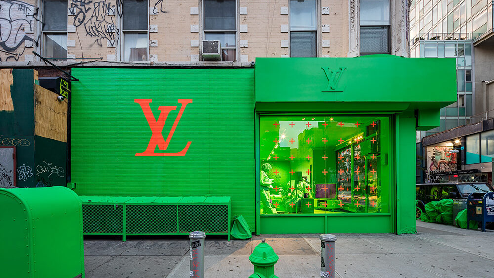
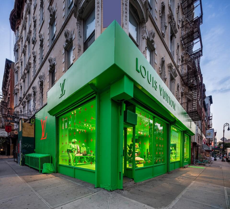
In light of Louis Vuitton’s bright green pop up in New York recently, would you say that this action was grounded in science and psychology or a PR stunt?
The response to this pop-up has been very interesting. We must distinguish the actual colour tones used. In nature, certain greens represent trees, plants, flora, nature and sustainability.
From a cultural point of view, green represents the heart in Buddhism and generally calming and rejuvenation in western society. From our studies, we have seen that fluorescent green, as is used in the pop-up store, grabs attention and raises heart rate in a disruptive way. The very fact that we are discussing its impact gives credence to this theory.
Considering we live in a digital world where we generally see green on screen more times in a day than on a tree, colour theory in this space has an ever-growing significance. A popular mobile phone provider uses fluorescent green to indicate a message has been received from someone using a different phone provider, where a calmer blue is used to indicate a message from someone on the same platform.
I come from a creative background myself, historically artists have used monochrome with varying degrees of success. I think the LV team have succeeded in grabbing our attention here.
At Breathing.ai you specialise in recognising which colours evoke certain emotions. If LV had contacted you, what colour scheme would you have recommended creating an immersive retail experience and why?
Personal difference plays a major part. We could try to apply stereotypes, such as light blue representing the sky, and therefore fresh and vitalising, and red representing danger and passion. However a person may have a family member who always wears red, and so the colour may represent familiarity or a completely different state altogether.
The very first thing we would do with a brand is to define its target audiences. We would then apply the customer data into our patented technology to ascertain exactly which tones evoke the desired emotional outcome.
We would then take our findings to the brand to guide them on choosing key colours which directly tap into their intended audiences nervous system. I am very interested to know if the collective brains at LV picked that colour for its artistic merit or from a psychological perspective!
conversation continued...
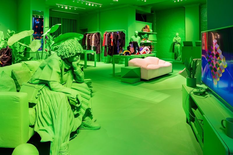
Can mono-colour in this way create an immersive experience in your opinion? or is it better utilised in other areas of life?
When used effectively, monochrome can profoundly impact someone. We live in an incredibly distracting visual environment today. It’s great to see this type of monochromatic beauty. The effect goes beyond linguistic processing, it’s pure.
What lessons can retailers and brands take from experts in mindfulness such as yourself?
I often find that brands and retailers come from a top-down ‘this is what we want to create and this is what we want it to look like’ perspective.
They should start with the audience. That way it will resonate at the deeper level. From there we can analyse the changing state, interest, and heart rate based on different stimuli. In mindfulness, we have used these techniques to promote stress reduction and wellbeing. With machine-to-machine communications today, these learnings could be scaled for brands to create immersive experiences in-store.